

Elizabeth is an award-winning and data-driven storyteller whose career began in the bathroom of a Victorian mansion (ask her about it). Her background in website design, digital marketing, and communications across nonprofits, museums, tourism, and economic development gives her a deep understanding of how people learn and connect.
Her work centers on visual explanation and public engagement. She applies complex data science to her work in data journalism, data visualization, illustration, exhibit installations, and marketing analytics.
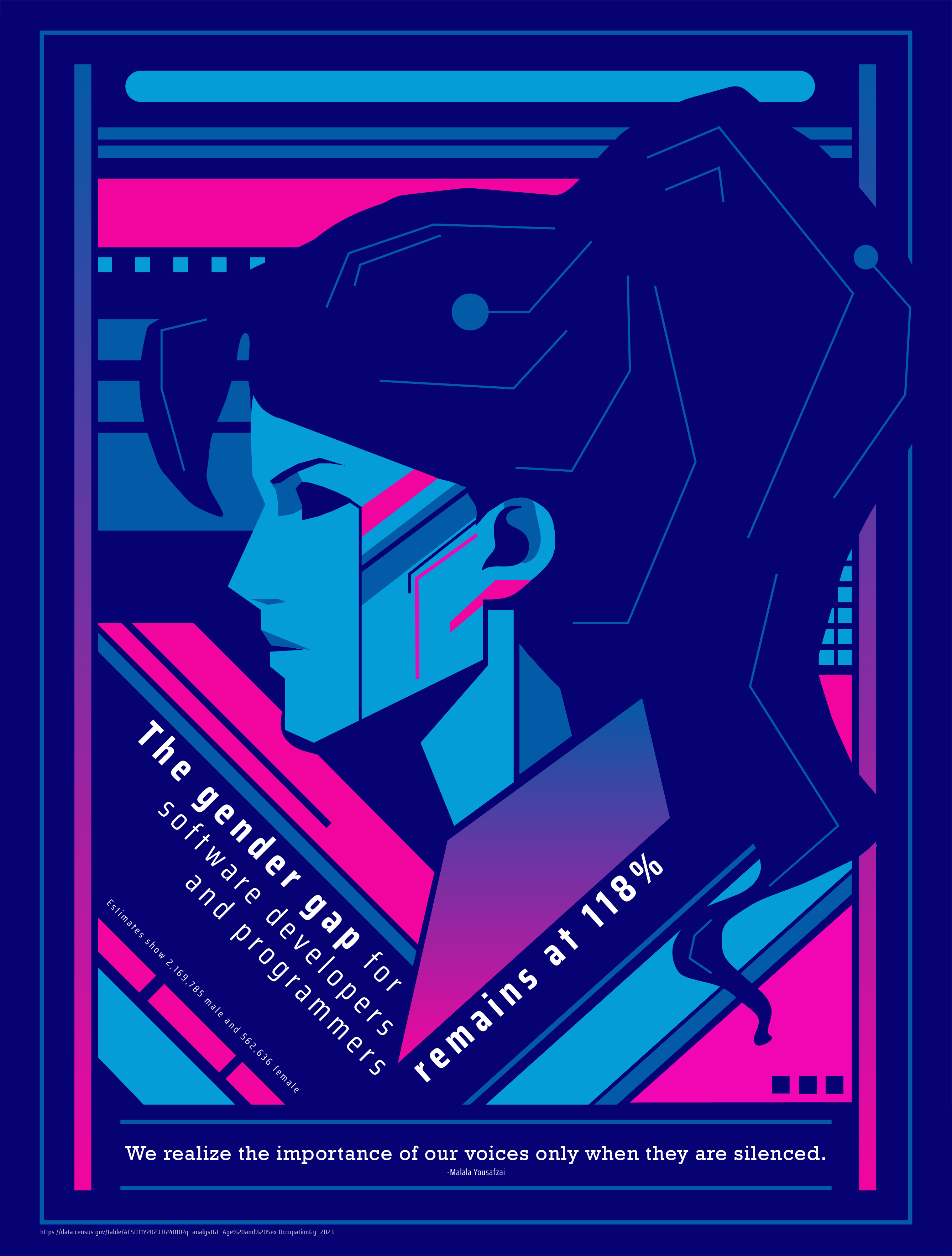
This design was created using Adobe Illustrator for the hero image in an annual report. By request, it was later used as a poster and printed piece to help encourage girls to enter into coding careers.
Graphic design for hero image in annual report.
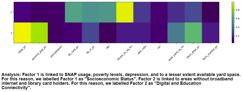
In 2023, the United Nations called on data teams to develop innovative, locally grounded solutions aligned with the UN Sustainable Development Goals, targeting one or more of six key transitions. Focusing on the intersection of food systems and mental health, we used structural equation modeling and exploratory factor analysis to identify two dominant factor groups. These groups helped us identify systemic barriers and enablers for sustainable food practices.
Structural Equation Modeling and Exploratory Factor Analysis.
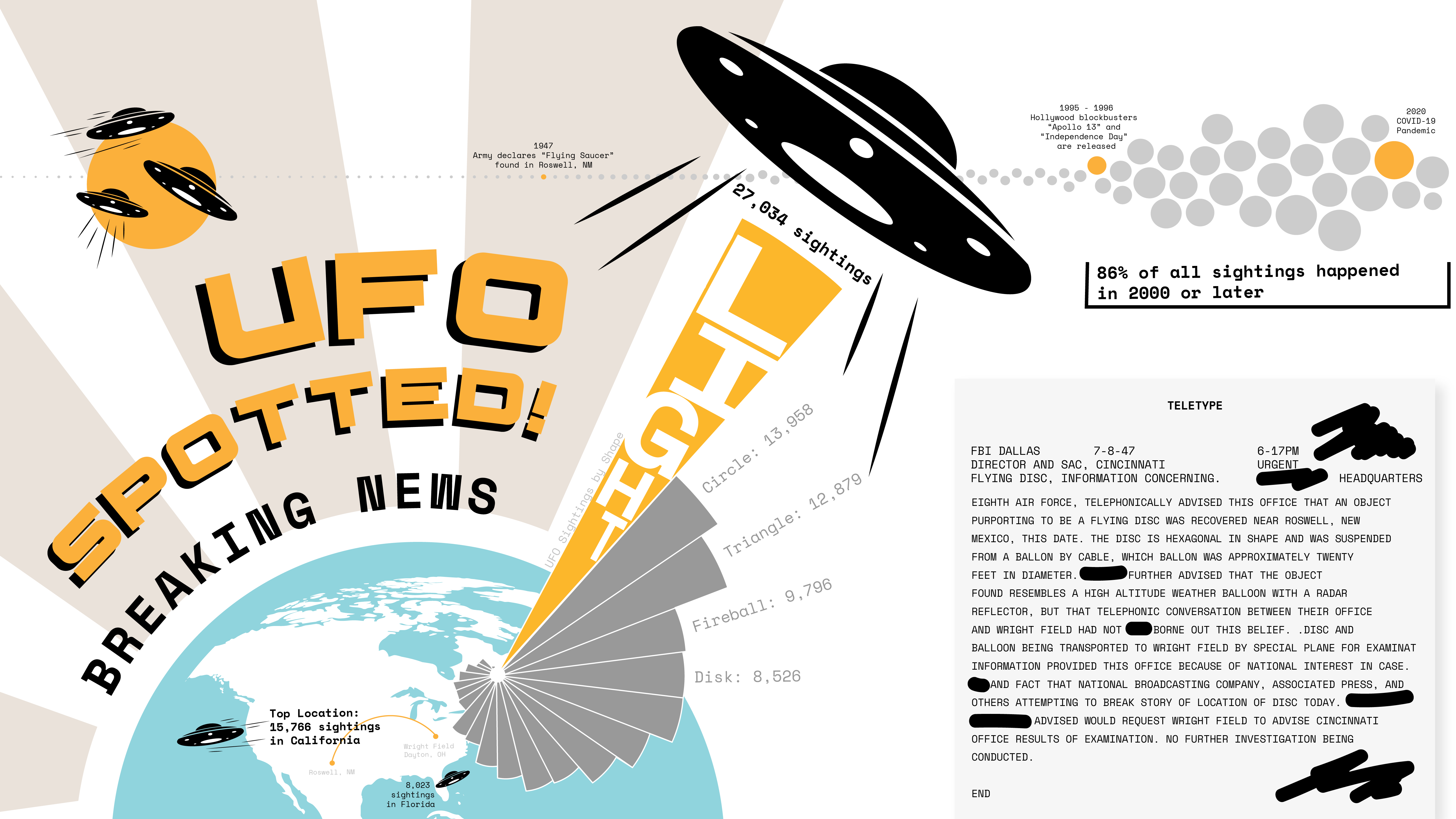
The first recorded UFO, according to the National UFO Reporting Center, was in June 1400. Throughout the next 400 years, rare sightings were recorded in journals, diaries, and official records with feathered pens, fountain pens, and typewriters. Fast forward to the summer of 1947 when a total of 41 UFOs were recorded by citizens staring into the heavens, and we entered into the Beige Age of UFOs. (Did you know? Scientists have determined the color of space is beige.)
Web scraping and trend analysis.
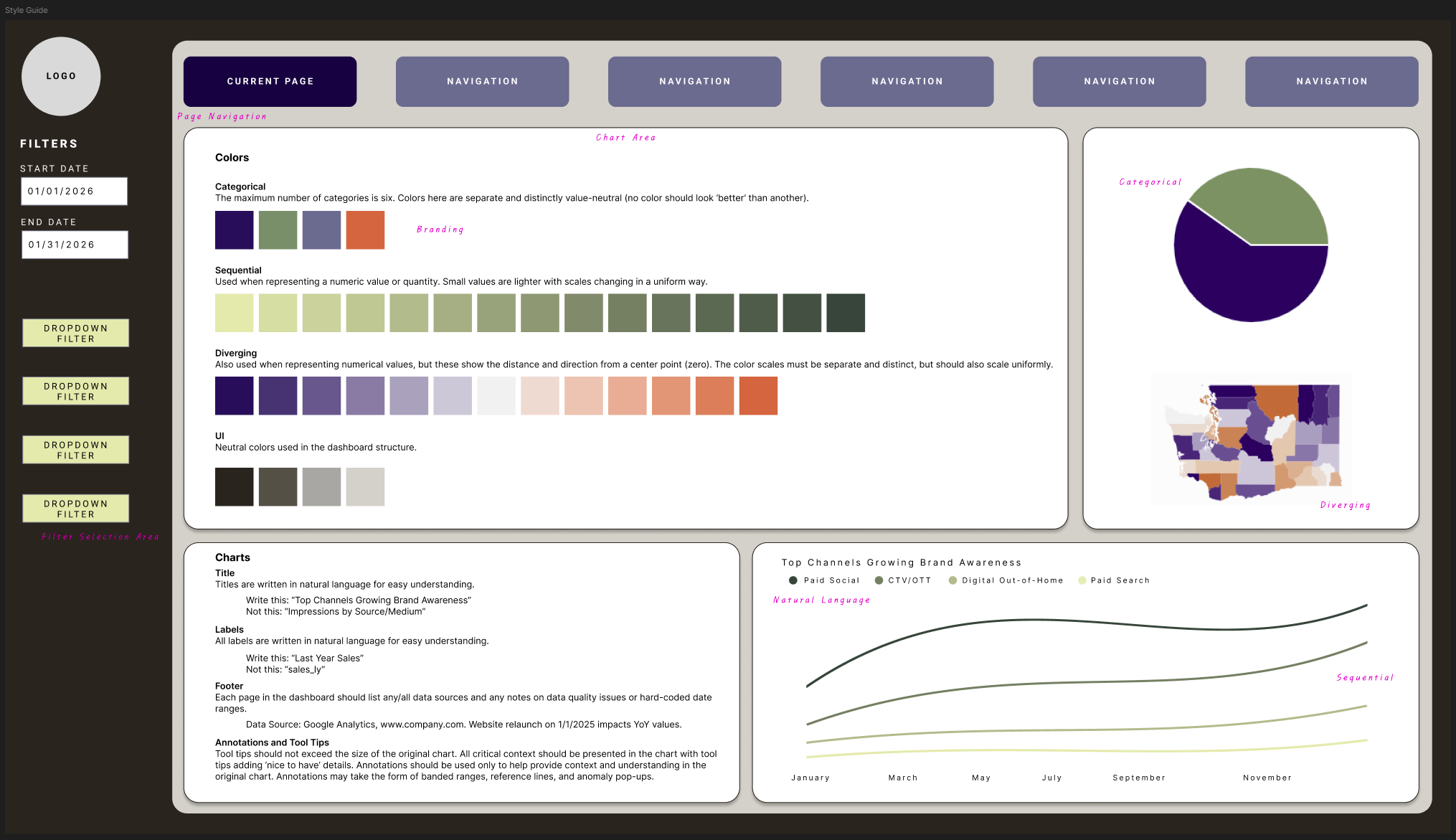
Dashboards are powerful tools for data visualization and decision-making. To ensure consistency and clarity across our dashboard designs, I developed a comprehensive style guide and wireframe using Figma. This guide outlines best practices for color schemes, typography, layout, and interactive elements, helping to create visually appealing and user-friendly dashboards that effectively communicate data insights.
Strategic foundations for dashboard development.
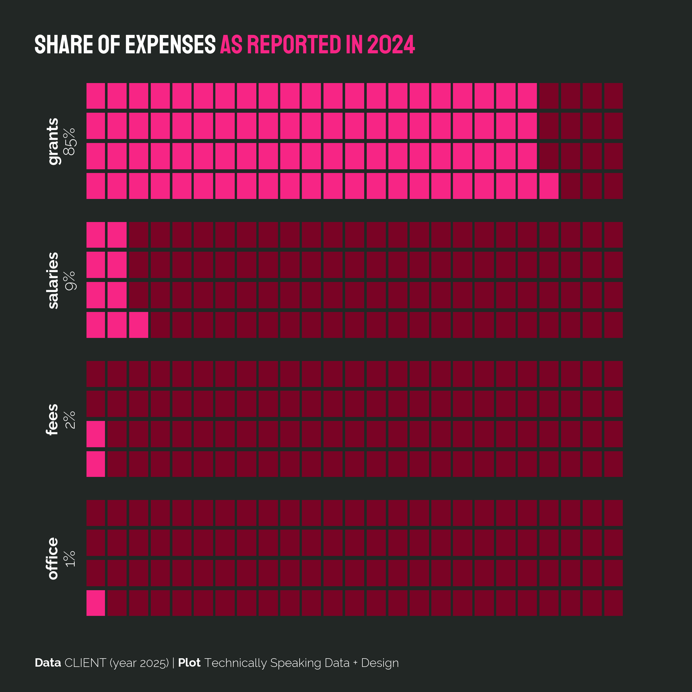
Using Adobe Illustrator, I designed a series of charts to illustrate the annual expenses of a nonprofit foundation. The goal was to create clear, visually appealing graphics that effectively communicated the foundation's financial stewardship to its stakeholders.
Graphic design for social media and annual reports.
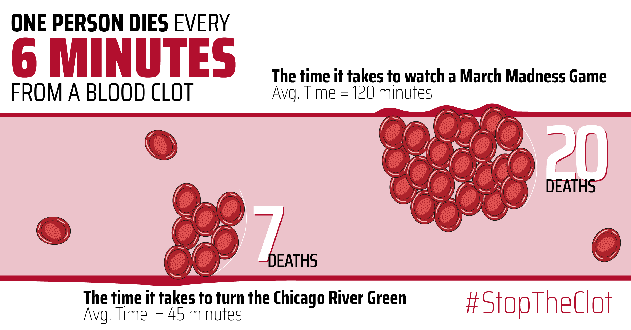
In honor of National Blood Clot Awareness Month, I designed an infographic to educate the public about blood clots. The design aimed to simplify complex medical information into an engaging and easy-to-understand visual format, using Adobe Illustrator.
Infographic design for social media.